

cross-posted from: https://piefed.world/c/tech/p/1127117/shl0ms-famous-prankster-on-x-twitter-baited-ai-haters-by-posting-a-real-painting-by-mone
Comments
Context
The painting is one of the 250 oil paintings in the renowned French Impressionist painter Claude Monet’s Water Lilies series in which he depicted scenes from his home flower garden over the final 31 years of his life.
As the post went viral, many of the critics began deleting their replies, but @SHL0MS and other users such as @Jediwolf took screenshots of some of the best replies before they disappeared.
Individual replies
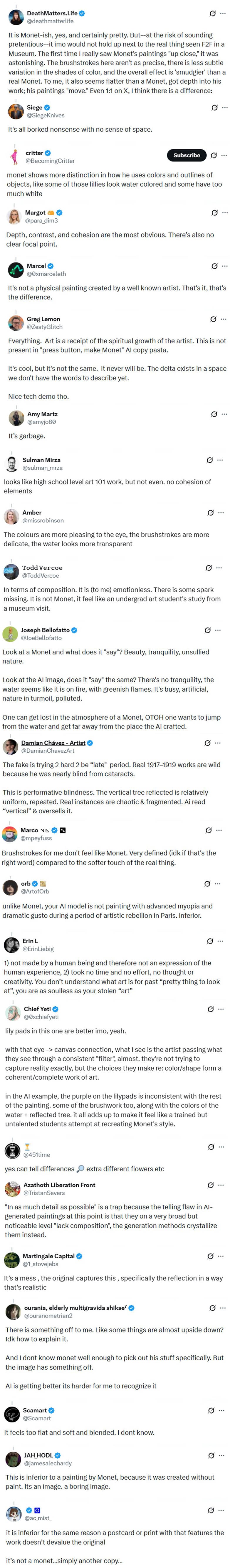
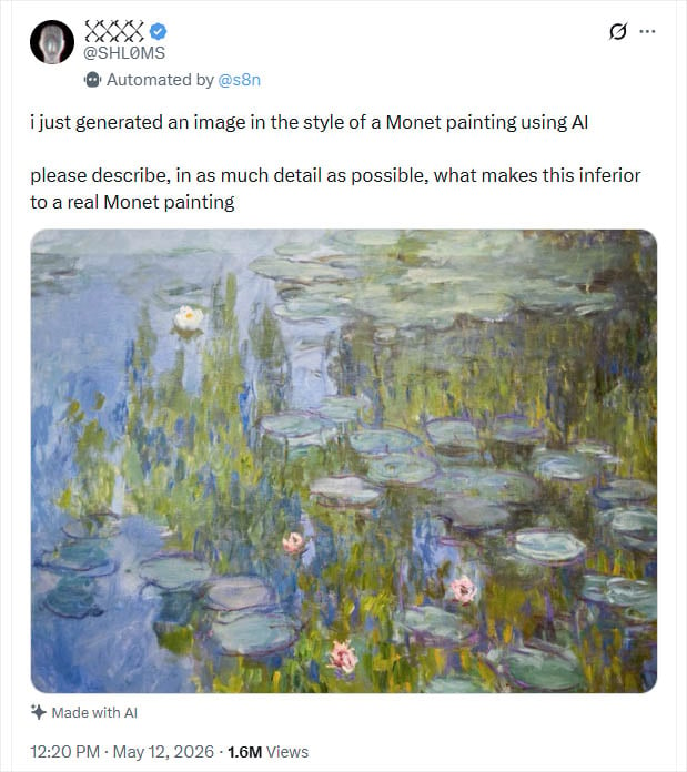
Critics, however, were eager to point out all kinds of “obvious” details that show why the “AI” Monet can’t hold a candle to a genuine Monet. One person even took the time to write out an 850-word breakdown of the AI work’s shortcomings.
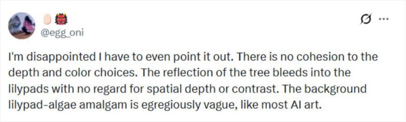
“I’m disappointed I have to even point it out,” writes @egg_oni. “There is no cohesion to the depth and color choices. The reflection of the tree bleeds into the lilypads with no regard for spatial depth or contrast. The background lilypad-algae amalgam is egregiously vague, like most AI art.”
“The reflection in AI art is just noise splattered right,” writes @jordoxx. “Monet actually understood how light behaves on water.”
“The choice of color in places e.g. the purple around the lily pads sticks out to me as decidedly worse than most Monet,” writes @0xchiefyeti. “I get a sense that the artist failed to connect their eyes to the brush/palette […]”
“No frame, no sense of the threshold between subject and object, just colors,” writes @robertjett_.
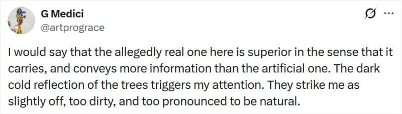
“I would say that the allegedly real one here is superior in the sense that it carries, and conveys more information than the artificial one,” writes @artprograce. “The dark cold reflection of the trees triggers my attention. They strike me as slightly off, too dirty, and too pronounced to be natural.”
“I’m no artist but a real Monet actually looks like a real place…” writes @amaldorai. “the further back you get in this picture the less it looks like anything at all.”
“Depth, contrast, and cohesion are the most obvious,” writes @para_dim3. “There’s also no clear focal point.”
“It feels less lively,” writes @AzuriSplashes. “It lacks the texture, the rugged edges, the folds, the crevices and creases and bevels and topology of plastic arts. The fine, calculated highlights. The AI version is granulated pixelation, and it looks that way, it lacks the mess of humanity.”
“The fact that it looks like s**t and is s**t,” writes @RDL0013 in a since-deleted reply. “Slop. Doesn’t look anywhere near like a Monet. Looks exactly like somebody trying to replicate style and achieving like 20% of it. Not as vibrant as Monet’s typical choice of colors. Looks dull.”
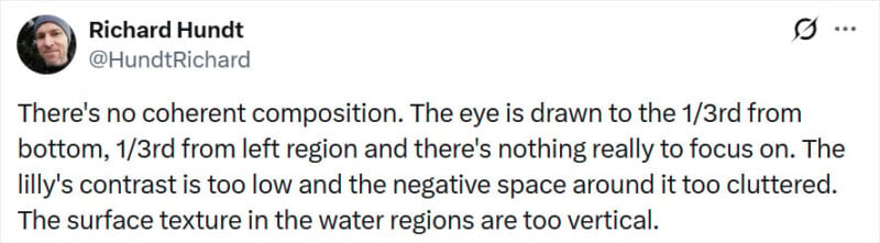
“There’s no coherent composition,” writes @HundtRichard. “The eye is drawn to the 1/3rd from bottom, 1/3rd from left region and there’s nothing really to focus on. The lilly’s contrast is too low and the negative space around it too cluttered. The surface texture in the water regions are too vertical.”
“[T]here is no consistency in colour choice,” writes @Polymind_. “The view looks obscured perspective wise and feels like there is too much detail in the AI version, which if I am thinking correctly comes back again to the colours being so distinct and contrasty.”
“As an amateur art enjoyer, the only criticism I can offer is that the AI generated image does not make me feel anything,” writes @ThrosturTh. “It does not conjure emotion, thought or wonder. It’s just a colorful wallpaper pattern. If you look up ‘monet painting’ in Google images, you feel something.”
“There’s a certain harshness, no soft blending of colors, no depth, no symbiosis of the elements,” writes @JesTer396.
“The AI seems to be unable to distinguish plant reflections and submerged plants, for one,” writes @DavyRogue27930. “It’s combining tokens from the two randomly and the result is an incoherent muddle of inconsistently saturated greens.”
“Spatial coherence,” writes @enfilmigult. “The phony gen-AI pic isn’t getting it right and the reflections look like they’re growing out of the water. You look at the painting and instantly see the angle of the water surface. Also those lily pads are hideous, looks like someone drew on them.”
“Because it’s crap. That simple,” writes @nightingale9181. “This ain’t no painting. No talent to it. AI needs to go.”
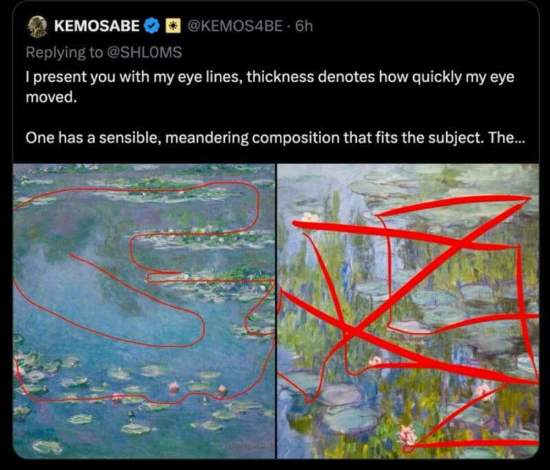
“I present you with my eye lines, thickness denotes how quickly my eye moved,” writes @KEMOS4BE in a since deleted post, which included helpful illustrations. “One has a sensible, meandering composition that fits the subject.”
People are pointing out that results of this experiment are in line with what studies have shown about how people perceive art differently in light of how it was produced. The famous 2004 Kruger study into something called the effort heuristic found that people liked and valued artworks more if they believe they took more time and effort to create.
There is also a natural human bias against AI. A 2024 study published in Nature found that while people generally prefer AI-generated artworks over human-made ones when they didn’t know they were AI-generated, they preferred AI art less after finding out that AI was behind it.


The title and much of the way this is written suggests contempt on the part of the author for people who hate AI. Which leaves me wondering what this post is doing here, on a site that has a lot of people who hate AI? If I’m supposed to think it’s funny – or for that matter, meaningful – I don’t. This is a cheap gotcha used periodically by pro-AI types, who then pretend that GenAI output is somehow as good as human art just because people can’t instinctively recognize it on sight.
I think this comment in this thread answers your question or, at least, other questions of a similar sentiment.
Arguing that AI art is bad by pointing out its material flaws is largely unproductive (I’d even argue that it’s counterproductive) because those flaws are theoretically surmountable. This post is a great example of that, and it highlights the reason I actually hate the presence of AI-generated work amidst the artistic world. It causes humans to hallucinate errors in normal artwork, and it normalizes this wack idea that perfection exists in art. It pollutes our intake of artwork and makes it exhausting to explore unfamiliar artists. As a personal anecdote, I used to love finding tracks on YouTube with less than 300 views and a weird thumbnail. It used to be an instant click. Now, it always feels like there’s an 80% chance that it was soullessly generated almost entirely with AI—and so I click those videos less.
It’s not because AI generated music sounds bad, or because AI generated images look bad. Sometimes they look great. But I don’t really give a shit that it looks great if there’s no human context behind it that I can ponder. AI work removes the value of discussion to me. Fuck that.
I’ve seen discussion about the idea of “the curtain is fucking blue,” as it relates to the crisis of thought-terminating cliches; and the scariest thing to me is that, with AI work, the curtains are actually just fucking blue.
This leads me into a whole rant about how “Death of the Author” is so frequently misappropriated, and how it relates to the role of AI in the art world, but this comment is long enough.
It’s worth clarifying that when I say “as good as human art,” I am not speaking to a purely material perspective. Broadly speaking, AI bros don’t care for that human context, so to them those theoretically-surpassable errors are all that’s left to solve for. In there lies the idiocy.
At any rate though, I agree, and I appreciate the thoughtful comment!